My Little Pony Backcards: A Stylistic Timeline
This page is an overview of some of the stylistic differences
between cards in the UK and in other places, and through the
years of release. For more detailed and numerous examples of
these cards, you can check the individual year pages, but I have
long wanted to put this information into one place on the site!
Early UK Card Styles: 1984-1987
These years mark the earliest years in which Hasbro UK produced
its own style of card. All cards are illustrated. These
cards all featured the old style of rainbow, with the original
font. Features listed below are generalisations, and there are
some exceptions (which I will note where I can).
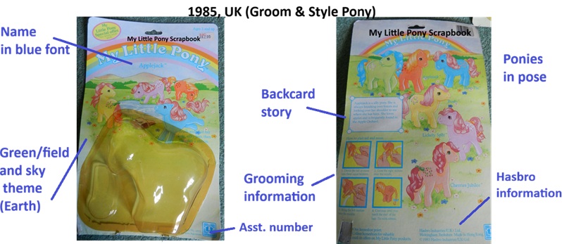
1984
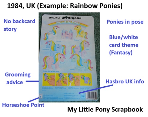
- Ponies do not have a backcard story.
- The name of the pony is printed in the bottom left corner of
the card in small blue font. This is often ripped off with the
bubble, making it harder to identify whose card it is when
loose, as there is no indication on the rear of the card.
- Pony set name featured in a white banner with blue font on
the front of the card, but not on the back of the
card.
- Ponies illustrated in pose.
- Adult Sea Pony names are printed in black, not blue font on
their box.
- Distinctive style of artwork, with thinner, more delicate
lines than in later iterations.
- Grooming information included: "How to plait your pony's
hair". Features a pony from that set.
- Hasbro information at bottom of backcard.
- Assortment number can be on front OR back of the card
depending on set.
- Earth Ponies depicted in a field/grass/sky setting. Fantasy
ponies in a blue/cloud sky setting.
- Front of card features three characters from the set, not in
pose. (Exception - front of the card for the 1984
Earth set features art from the US 1983 backcard).
- Many of these cards, and ponies continued to be sold into
1985. Cards were not updated.
1985
- Ponies had backcard stories (shorter than in the US, and
usually in a small white box bordered in blue, orientated
left)
- Ponies drawn in pose
- Art style distinctly different from 1984, more purposeful
and less delicate.
- Cards featured grooming information (how to plait a pony's
hair) using a pony from that set.
- Earth Ponies depicted in a field/grass/sky setting. Fantasy
ponies in a blue/cloud sky setting (some of these were
continuations from 1984)
- Pony set name features on front of card/box in white ribbon
with blue font (Exception: 1985 Earth Ponies have no set name
on their card, and so no white ribbon).
- Short piece of descriptive text on card front.
- Characters from set featured on front of card, not in pose.
- Card had horsehoe point (has been removed in above example)
1986
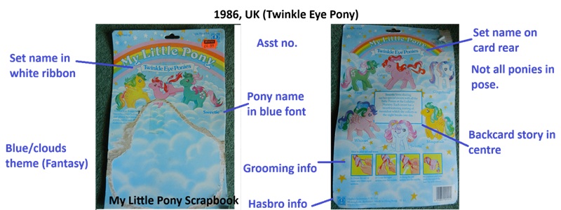
- Set names featured on the front of the card in white banners
with blue font.
- Exception to point 1: 1986 regular set did not have a set
name on the card, and instead the pony's name was in the white
banner with blue font, as shown below. Font used was the same
as for the set names. Ponies sold in box also had
their names written on white ribbon banners.

- Other pony sets (aside the 1986 regular set) had names in
blue font on the front of the card, either mid right or bottom
left.
- Name of set included on the back of the card.
- Backcard stories in the centre of the backcard art, in a
white box with blue border.
- Some ponies illustrated in pose, but no longer the rule.
- Grooming information (how to plait your pony's tail)
featured, using a pony from the relevant set.
- Assortment number often on rear of the ard.
- Card themes: regular set features grass/sky, fantasy sets
feature clouds/stars/blue sky, sea ponies feature water.
- Short piece of descriptive text on card front.
- Ponies from set (usually three) featured on front of card,
not in pose.
- Cards had horseshoe points (removed in above example).
1987
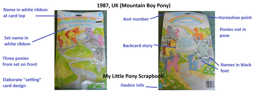
- Pony names in blue font on a white ribbon on the top
right of the card, set name in blue font on white ribbon
under the rainbow. This also repeated with ponies in box
this year, where the name is often on the front of the box
at the bottom.
- (Exception to the above: Movie Star Pony set have no set
name on the card, and have their names on white ribbons
under the rainbow in English language release).
- Backcard names now in black font, rather than blue on
backcards (still often blue on boxes)
- Each pony set has a distinctive illustration for their
particular theme. This year's cards are very elaborately
themed.
- Backcard stories no longer in a white box, printed in
the centre of the card in blue or black text.
- Ponies no longer in pose at all.
- Grooming information featuring a pony from the set (how
to plait your pony's hair) - featured on some cards but
not all, and not on boxes.
- Cards have horseshoe points
- Three ponies from set usually featured on the front.
- Asst number often on back top of card.
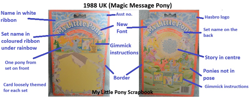
Card Changes: 1988
1988 was a distinctive year for the card styles in both the UK
and in much of Europe. The following changes can be seen from
the earlier style on most cards from this year:
- All cards now have a coloured base and a different colour
thin border around the edge. In direct contrast to North
American cards from this year (which were often white or pale
colour based), most are in bold colours with bright
borders.
- All cards have updated font on the rainbow, the y is no
longer curled.
- Many 1988 cards are dated 1987, but the font change gives
them away as 1988. There are no exceptions to this.
- Some 1987 ponies continued to be sold in 1988, in the same
boxes as 1987. Several sets had releases in Europe in 1987 UK
style boxes in 1988, but the rainbow was updated, giving away
the year of release (for example Flutter Ponies, Tutti
Frutti).
- All cards feature the set on the back, with names alongside,
and a story in the centre.
- These cards were standard in English, French, German, and
Spanish (the last usually featuring Spanish made ponies).
- Boxes for new sets this year (Newborn Twins, First Tooth
Babies) were heavily based on North American packaging, with
updated rainbows.
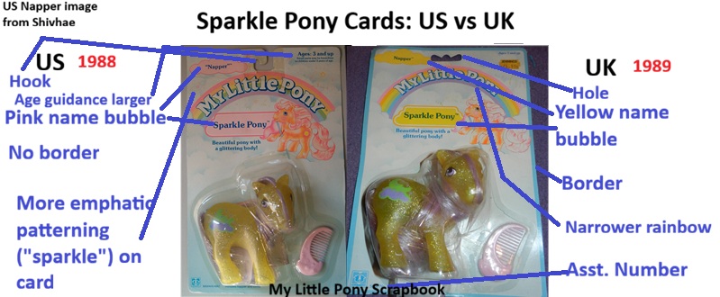
1989
Cards in the UK from 1989 mostly used North American card
artwork, but each card had words/spellings amended, names
sometimes changed and all of them had a coloured border around
the edge, marking them out from their American counterparts.
(Some exceptions do exist, such as the individual Loving Family
Ponies, and Princess Brush & Grow Ponies). Boxed release
ponies did not have borders.
This was also seen in many German, Spanish and French set
releases from this time (some unique cards exist in these places
that were not used in the UK).
Some of the card art used in the UK in 1989 was based on card
art used in North America in 1988 (as many sets were released a
year behind). Some packages had minor differences. A good
example for comparison of these is the Sparkle Pony set - see
below.
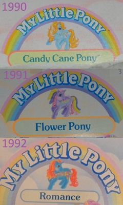
1990-1992
European cards in the early 19990s were largely uniform between
countries. Adults were "From the Classic Collection", while
babies were "From the Baby Collection." The motif of the
nineties cards was to collect them all and "step into the world
of ponyland."
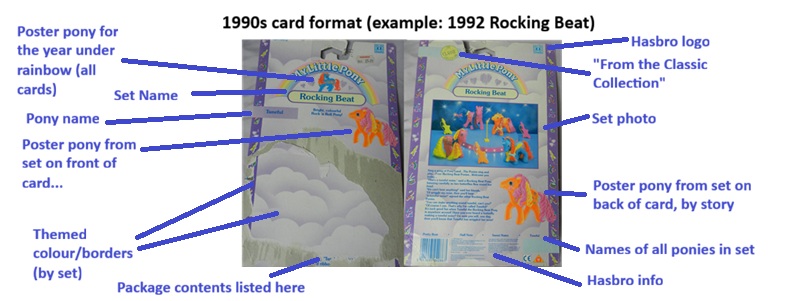
- Cards all featured borders, with small art details relating
to the set theme.
- Each set had a different colour scheme.
- Boxed sets from this year also featured these same
characteristics - border, colour scheme, photo, layout etc.
- Cards all featured a photo on the back - in 1990, this was a
general group of ponies available, in 1991 and 1992 this was
the relevant set.
- One pony each year was chosen as a "poster pony" to appear
on the front of every card, under the rainbow on the front and
back. In 1990, this was Mainsail. In 1991, Rainbow Rider. In
1992, Tuneful (see below).
- One pony from each set was drawn on the front and back of
all cards from that set.
- Cards were translated into several languages across Europe,
but were basically the same design for all countries.
- All ponies had individual stories, unlike some of their
equivalents in North America.
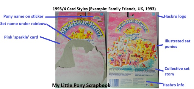
1993-4
- Cards in the UK and Europe now garishly pink.
- Pony sets drawn on the back.
- With the exception of the Seven Characters, pony names were
stuck on the card with labels.
- Stories were collective and generic between sets.
- Cards had more of a slice of life theme and a new style of
artwork.
 Respect the resource: Majesty is watching.